
Precision in motion
where speed meets style.


Engineered for those who live at full speed, the Seiko Sportura collection fuses cutting-edge technology with bold design. Inspired by the adrenaline of motorsport, each timepiece delivers uncompromising accuracy, dynamic aesthetics, and enduring strength. Whether powered by quartz or kinetic movement, Sportura watches are built to perform — with water resistance up to 100 metres and dials echoing the dashboard of a high-performance machine.
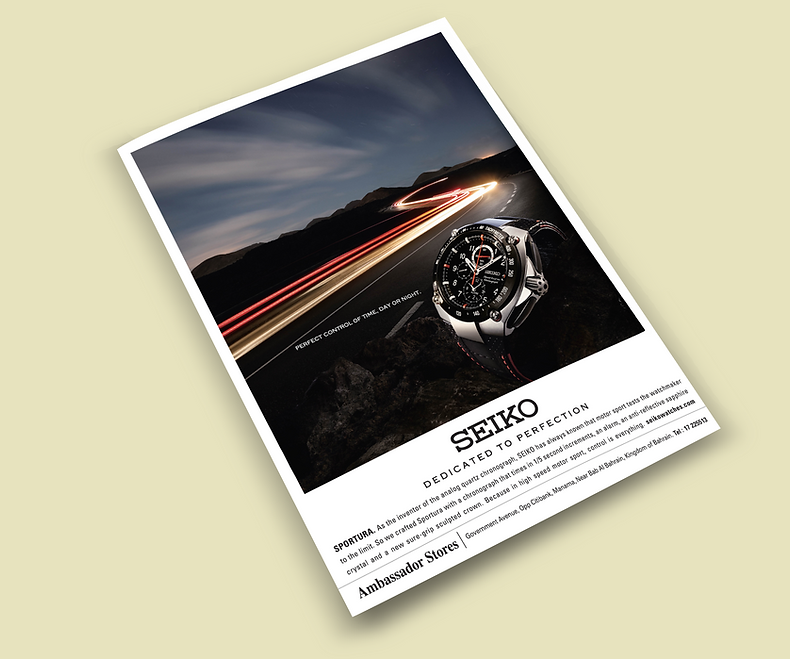


SEIKO – Campaign Case Study
Magazine & Print Advertising – GCC Region
Seiko wanted to promote its Sportura chronograph series, highlighting the brand’s long-standing connection to speed, precision, and performance. There was also another brand Velatura with the similar features. These both campaigns aimed to attract high-end, style-conscious male consumers across the GCC, blending technical sophistication with emotional aspiration.
Design Challenge
-
Create a visually powerful ad that captures both sport performance and luxury appeal.
-
Communicate the mechanical excellence and Japanese craftsmanship of Seiko.
-
Maintain global brand integrity while adapting the visual tone for the Middle Eastern market.
-
Achieve all of this in a single print and magazine layout where every element feels premium.
Creative Concept
“Precision in Motion.”
The concept draws inspiration from the seamless coordination between time and performance — the exactness of a chronograph movement mirrored in the dynamics of speed and light. The ad fuses technical detail with visual emotion, presenting Seiko not just as a product, but as a statement of control, confidence, and class.
Design Approach
-
Imagery: The watch is positioned in dramatic lighting, emphasizing its polished steel case and chronograph dials. A blurred motion trail subtly echoes high-speed movement, referencing motorsport energy — a nod to Seiko’s sponsorship of Formula 1 events.
-
Composition: Used a cinematic diagonal axis to suggest motion and direction, leading the eye naturally from the Seiko logo to the product.
-
Typography: Minimalist, uppercase sans-serif with ample spacing — reflecting the watch’s precision.
-
Color Palette: Dominant black and metallic grey to evoke strength, contrast, and depth; accented with Seiko’s signature orange chronograph details for visual focus.
-
Lighting: Strategic highlights on the bezel and glass create a tactile, almost 3D realism that conveys craftsmanship.
Execution
-
Created in Adobe Photoshop and Illustrator with high-end retouching for metallic reflections and texture.
-
Calibrated the artwork for both print and digital outputs — ensuring the blacks retained depth without losing contrast in press production.
-
Versions prepared for A4 magazine ads, billboards, and retail point-of-sale posters.
-
Delivered both English and Arabic tagline options, with type alignment carefully balanced for bilingual readability.
Results
-
Successfully elevated the Sportura identity within Seiko’s product lineup — praised by Seiko’s regional distributors for its “luxury-grade presentation with performance energy.”
-
The ad was used in multiple regional magazine placements and in-store branding.
-
Helped reinforce Seiko’s reputation as a precision-engineered brand with emotional sophistication.