


Berger Paints
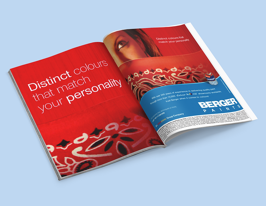
This campaign for Berger Paints explores the emotional and cultural resonance of colour through bold visuals
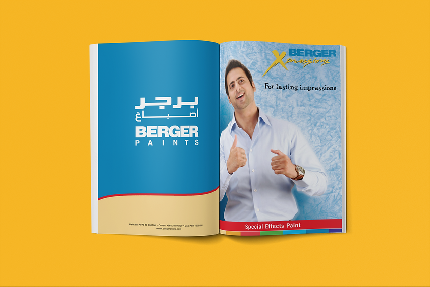
and evocative messaging. From vibrant lifestyle imagery to regionally tailored designs, each piece was crafted to reflect Berger’s diverse audience and elevate its brand identity. My role spanned concept development, layout design, and final preproduction — blending expressive typography, striking palettes, and localized themes to create a cohesive, high-impact series. The result is a visually rich campaign that celebrates colour as a form of personal and cultural expression.

Berger Paints – Campaign Case Study
Magazine & Print Advertising – GCC Region
Campaign Objective
Berger Paints aimed to strengthen its position as a trusted, premium paint brand across the GCC by showcasing its advanced colour technology, long‑lasting protection, and modern lifestyle appeal. The campaign was designed to connect with homeowners, architects, and style‑driven consumers seeking durability, elegance, and a refined aesthetic for their living spaces.
Design Challenge
• Create a visually compelling advertisement that communicates both beauty and performance.
• Highlight Berger’s superior paint technology, including weather resistance, smooth finish, and rich colour depth.
• Adapt the global brand identity to resonate with Middle Eastern tastes, where warmth, luxury, and architectural detail play
a key role.
• Deliver a premium layout suitable for high‑end magazines and regional publications.
Creative Concept
“ Colour That Lives With You.”
The concept celebrates the emotional and functional role of colour in everyday life. It positions Berger Paints not just as a coating, but as a transformative element that elevates mood, enhances space, and withstands the region’s demanding climate. The ad blends lifestyle aspiration with technical credibility — presenting Berger as the perfect harmony of beauty, protection, and innovation.
Design Approach
Imagery
A hero interior or exterior space is showcased in rich, vibrant tones, demonstrating the depth and smoothness of Berger’s finish. Soft natural light highlights the texture and purity of the colour, while subtle shadows add dimension and realism.
Composition
A clean, modern layout with a strong focal point — the painted wall or architectural detail — supported by lifestyle elements such as furniture, décor, or outdoor scenery. The composition guides the viewer from the visual impact of the colour to the Berger logo and product line.
Typography
Minimal, elegant sans‑serif typography with generous spacing to evoke sophistication. Headlines are bold yet refined, reinforcing the brand’s confidence and premium positioning.
Colour Palette
Warm neutrals, deep accent colours, and Berger’s signature tones are used to reflect both modern interior trends and the region’s cultural aesthetic. The palette conveys comfort, luxury, and timelessness.
Lighting
Soft, diffused lighting enhances the richness of the paint finish and creates a welcoming, aspirational atmosphere. Highlights are carefully placed to show the smoothness and durability of the product.
Execution
• Designed using Adobe Photoshop and Illustrator with detailed retouching to ensure colour accuracy and realistic surface texture.
• Calibrated for print production to maintain colour consistency across magazine stock and outdoor formats.
• Delivered in multiple sizes: full‑page magazine ads, half‑page layouts, billboards, and retail point‑of‑sale posters.
• Versions prepared in both English and Arabic, with balanced typographic alignment for bilingual readability.
Campaign Impact
• Strengthened Berger’s brand perception as a premium, design‑forward paint choice in the GCC.
• Praised by regional distributors for its “elegant visual storytelling and strong lifestyle appeal.”
• Featured across leading home décor magazines, trade publications, and in‑store branding.
• Helped reinforce Berger’s reputation for innovation, durability, and colour excellence in a competitive market.